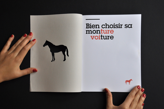
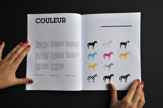
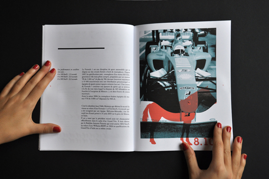
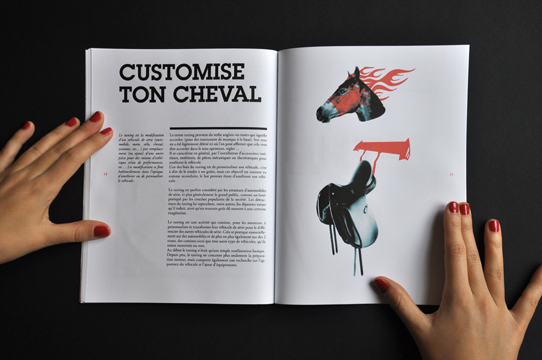
Julie Michel has an interesting approach to type and layout and the overlaying of information and imagery. I thought this was an interesting approach to information on cars. I like the variation of different elements across each double page spread. It changes things around a bit and makes the publication less samey and holds your attention more.
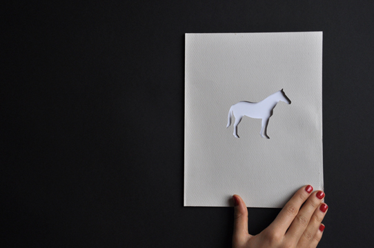
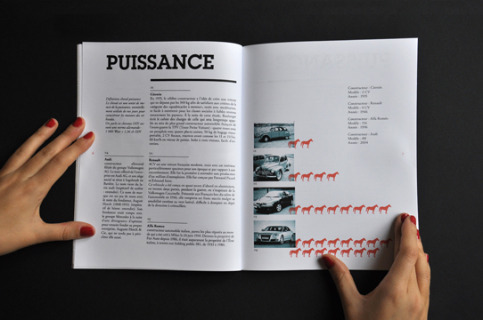
The overlaying of coloured vectors and black and white photography is stunning and adds extra depth to the imagery. Also the die cut front cover is really stunning and simple in its delivery.
No comments:
Post a Comment