John Heartfield


John Heartfield (19 June 1891, Berlin – 26 April 1968, East Berlin) is the anglicized name of the German photomontage artist Helmut Herzfeld. He chose to call himself Heartfield in 1916, to criticize the rabid nationalism and anti-British sentiment prevalent in Germany during World War I.


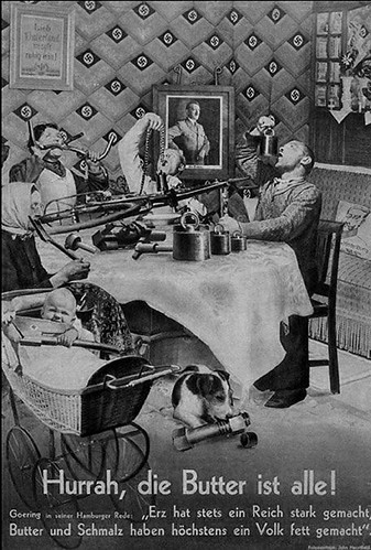
This is an interesting poster which shows the big Business men behind Hitler. I think this is reflected in today.

Photomontage is something which when done properly can work extremely well. I think the whole Propaganda posters fits in well with the idea i have for my t-shirts and how that can relate to screen print production


Micah Lidberg


Interesting logo type from Michah Lidberg. Works well in one colour. Bold too.

Agency 26


Strong visual logo work from Agent 26

Logos

I'm currently working on two logo briefs. 1) is for the t-shirts i'm producing for communication arts brief 2) is for a series of crowd spring logos i'm going to do.
Anyway

KLAS ERNFLO
Identity design for Still Light shop in Barcelona and the first two in a serie of posters that I will do for them


Simple and clean logo applied across different media. Noice

http://dropular.net/drop/2936


www.marcalcock.co.uk


found this on dropular. i loved the fold out on the zine. How the inner pages were wider than the cover
unfortunately the url for marcal doesnt work and ive tried different combinations

Simple


This is an interesting image/typographical poster. The colour pallet is really cool and backs up the idea of opposites and contrasts

More Unequal-Design


This is some more editorial work from Dylan C. Lathrop. Its so simple. Reminds me of The Guardian. Layout and typeface use compliments the simple/select colour pallet.

Unequal-Design - Home of Dylan C. Lathrop

Heres a post from his blog:

I love the simplicity of this editorial magazine.
The layout works really well and the repetitiveness of it makes it easy to glide through.


There has been a long lull on this blog, and for that, I am sorry. But I have been living, so no need to fret. What you see above is something that I was working on for some time in DesignWorks, the freshly made over MCAD Magazine. This was done under the direction and aid of MVA, and I'm forever indebted to them for all they taught me. It was a big design challenge and I'm glad that it is now out in the world. Big ups to JZK for all his help and tutalage. I'm glad he saw fit to put me on this project and saw fit to help me along the way.

So, in near a month long absence, what have I been doing? Well, I've been roadtripping every weekend with friends, going to
hometown after hometown afterhometown, doing a circuit of carnivals and fairs in each one. All of that has been pretty great, though it made me long for my own hometown, and as such, I'll be wrapping up this month long tour with a short visit to Cheyenne. The reasoning is two fold: as I mentioned before, I got fams to see and funnel cakes to eat, but secondly, I gotta get my phone plan switched around, which will make me become part of an elite group of bholes known as "iphone owners". I make this leap because the 3GS seems so hot to trot that I can't hold my breath a second longer awaiting the ability to play Edge AND answer phone calls. So, I'm sorry if you see me brandishing this device and looking particularly pretentious: it's just the phone wooing me.

I should also note some praise for some friends up in hurr.
Colin S. Trechterrecently got some favorable news on a new assignment for when he gets to his other homeland, Australia in a couple months time. The project sounds sweet, though I'm unsure if I should be the one divulging all of the greatness, so I'll just point you to this tumblr link. Congrats dude! Also, Justin McKinley won a design contest for FRWD, doing a redesign of their brand. Totally amazing! Justin is gonna exit this summer with a robust resume and he should mega proud, as we all are of him. Lastly, Levi Rubeck has begun his assault back on the webershed with new updates to his blog. Levi completed his graduate studies in creative writing this past spring and I'm glad he is getting back to some sort of constant bloggage.

Man, this post was super TL;DR and linky. HAYSUP INTERNET!

Pink Addiction


Hand made packaging for limited edition tshirt pack thermo foil printed over nonwovens and EVA printed tag

Levis


Levi’s is introducing a wide range of brightly colored jeans for Spring/Summer 2009. Each pair comes in unique paint can packaging. The style of the packaging and the way it relates to the product is beautiful.

Oddica


Custom printed plastic bags that have changed per design. Simple and probably cheap to do

Johnny Cupcakes Packaging

Johnny Cupcakes is a brand that focuses on the minor details. The packaging is all part of the experience of buying from this brand. The tissue paper and sticker are the perfect first layer. The mail box which used to ship to the UK was lightweight but just made the delivery all the more personal, as apposed to a UPS delivery bag.

I'm only going to produce 5 t-shirts for hand in. I want the packaging to work as part of the series not simply for delivery purposes. I have a few ideas knocking around.

Packaging


Weird Clothing packages these meat print shorts in meat packaging.

Supreme


The NYC Elite. Supreme clothing is so simple and clean cut it just sells. This t-shirt is one of many simple designs.
This was actually featured in an article counting down the best tees of the 00's.


More Stussy


Stussy have such simple tee designs. The type always works well together and the colours compliment each other.

Distortion


http://dropular.net/content/_fixed/nxdi0s1ci_3280813258_304558e70c.jpg

Specimen No. 520 S
I plan on distorting faces and experimenting with distortion of politicians faces for my t-shirts. Would be cool to do something like this. In order to project their sleazy stories through distortion


http://think.faesthetic.com/?m=200901&paged=5

Marc Jacobs


Clean. Clear. Simple

Original Fake


Another Jacko T-shirt. I love the mixing of KAWS illustrations with Photographs. Its what he is renowned for. I also love the Blue Death tint. Sick

Raised By Wolves


Ultra


Clean and Simple

Rockwell Clothing


by Para have a series of new tees. Simple shapes and amazing colours make up these really cool tees.


TRIUMVIR – LIVE LONG AND PROSPER


Simple edited photos. I want my tees to be something simple and effective. Like these.

10 DEEP X ALTAMONT – HOLIDAY 2009 COLLECTION


Simple halftone photomontage making up Hunter S. Thompsons face.
Love mixing in the steadman feel still. Works superbly

Mighty Healthy x Extra Butter


Simple Photomanipulated tee. Interesting colour use

Tyra Clothing and Mash Kulture


Simple line work. Cool colours

Us Versus Them


Simple type and layout. So many decent american t-shirt companies. Love it.