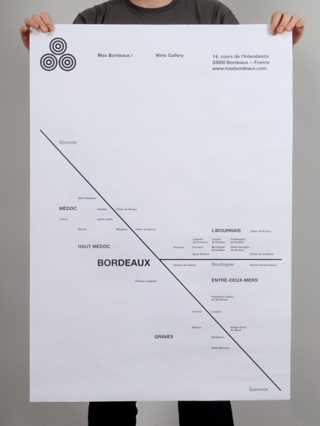
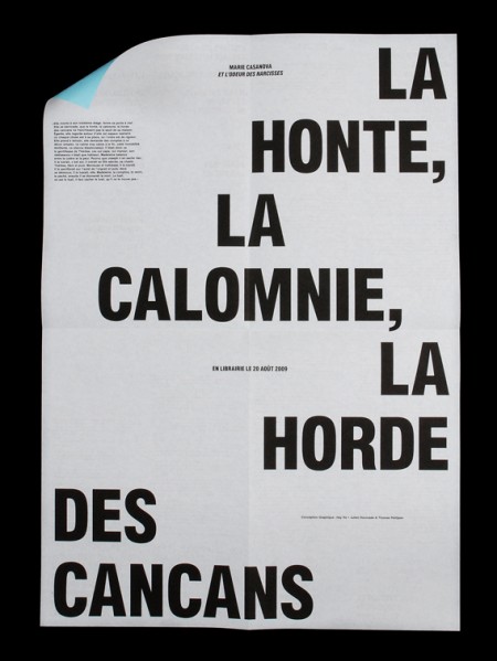
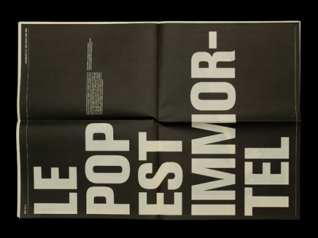
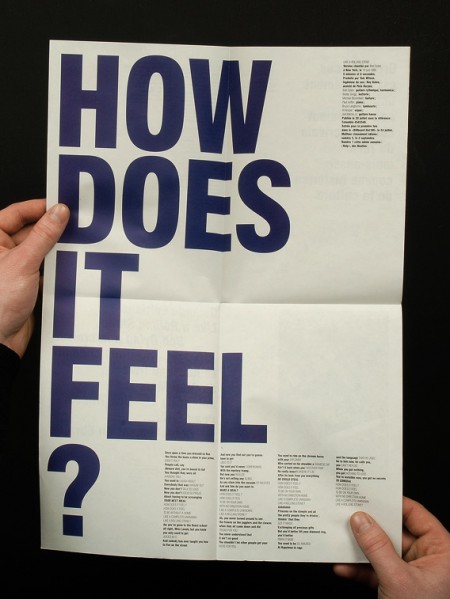
Strong typographic work from Hey Ho Studio.
Scott Hansen posted this on his blog iso50.com and made an interesting point about the balance of elements within Hey Ho's work. You can not take any elements from this poster without making it feel less complete. Perfectly balanced. It got me thinking of how much information you can take away from something before its redundant and useless. Similar to the work on Film The Blanks.
This could be an interesting line of enquiry for over my FMP


No comments:
Post a Comment