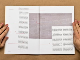
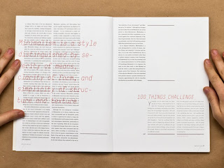
The layout and composition makes this first issue really stand out. The limited use of colour also adds to the feel and doesn't overload the senses. I was drawn to this work as the circle elements reminded me of what me and Andy have been doing on the art and design year book.
Subscribe to:
Post Comments (Atom)


No comments:
Post a Comment